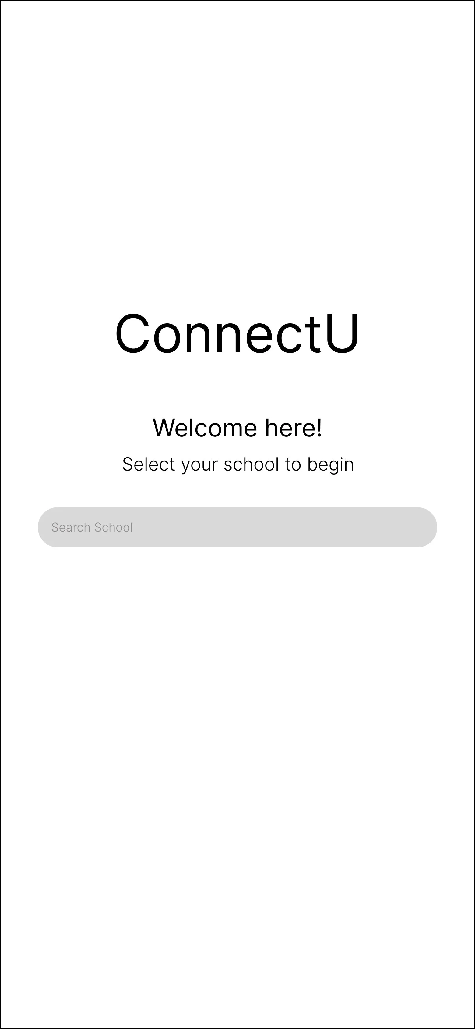
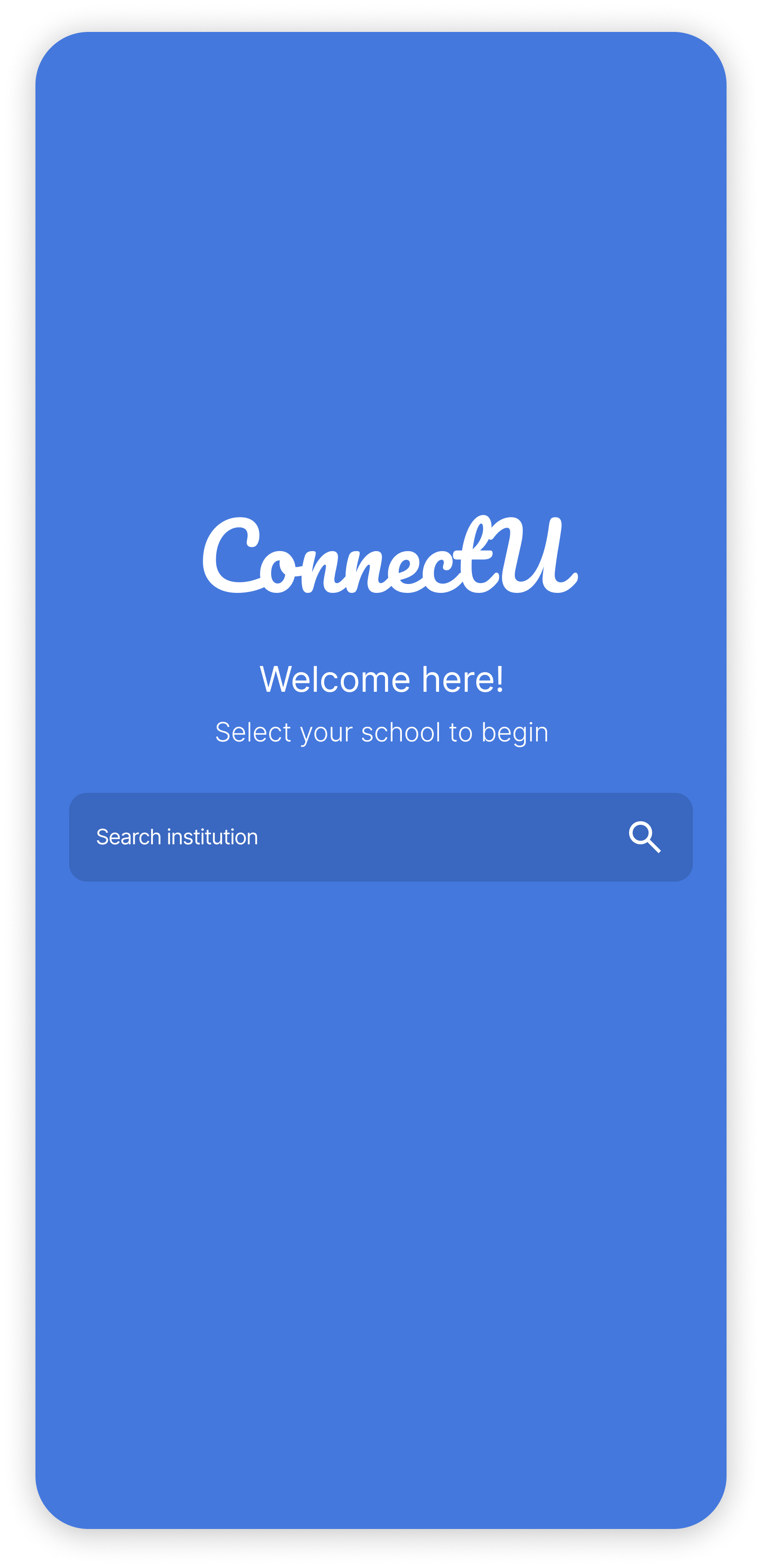
ConnectU
Mobile App | Rice Design-a-thon
Overview
- Submission for the 2024 Rice Design-a-thon 48-hour design challenge
- Addressing a lack of opportunities for college students to get advice from fellow students
- Research, design, and prototyping of a peer to peer mentorship app for undergraduates
- Design collaboration
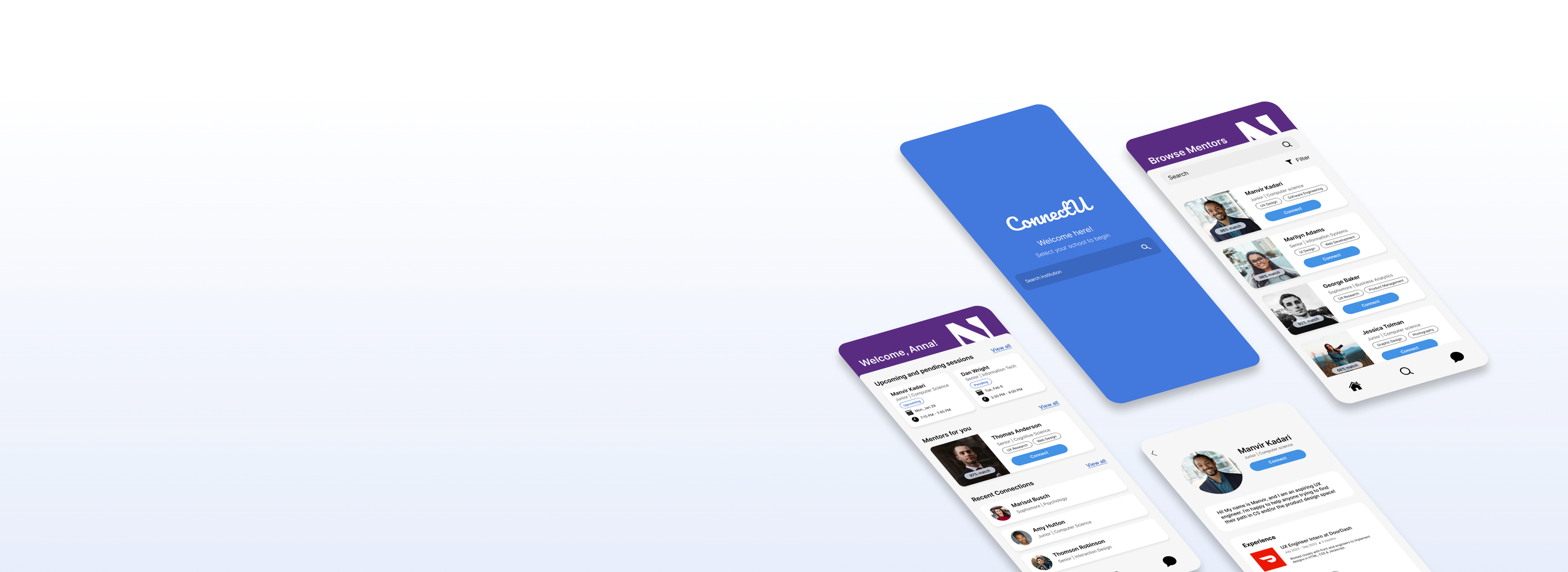
Prototype
Roles
UX Reseach, UX Design, UI Design
Duration
48 Hours
Teammates
Milan La, Nicole Gunawan, Joanne Tsai
Tools
Context
The Problem: Finding Relevant Advice is Difficult
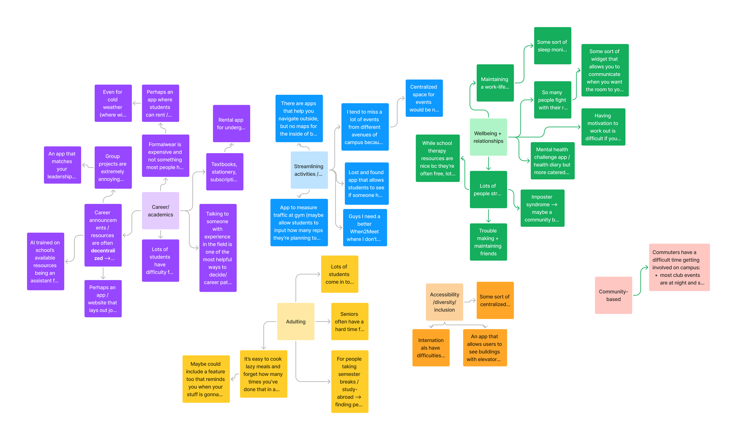
I participated in Rice University’s annual Design-a-thon, a remote event attended by hundreds of student designers looking for a challenge. Once the prompt was announced, my team began brainstorming issues we’ve faced and putting them on an affinity diagram. One thing we all agreed on was how asking an upperclassmen to lunch or reaching out to a classmate can be challenging, yet advice from fellow students can provide the most tangible pointers for navigating college life.
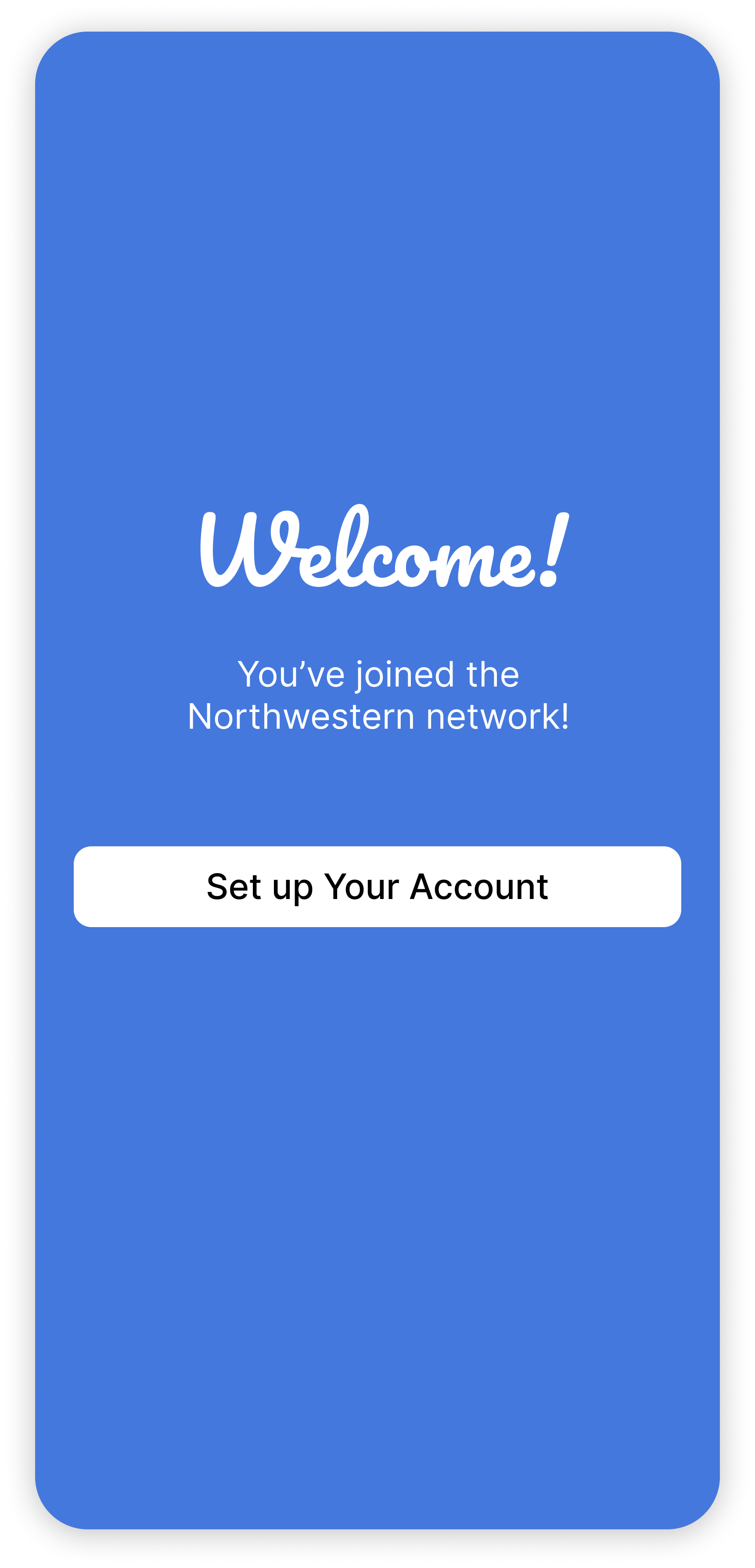
Students lack a reliable platform to connect with other students with firsthand experience to help with choosing courses, understanding material, and growing their careers. My teammates and I proposed ConnectU, an app for student-to-student connections at the campus level to help undergraduates receive grounded advice throughout every step of their professional, academic, and social journeys.
Design Timeline

Discovery
User Research: Surveys
We quickly brainstormed and created an 8-question survey that was sent to 27 participants. We essentially wanted to know about where and how students go about seeking advice about classes, majors, etc.
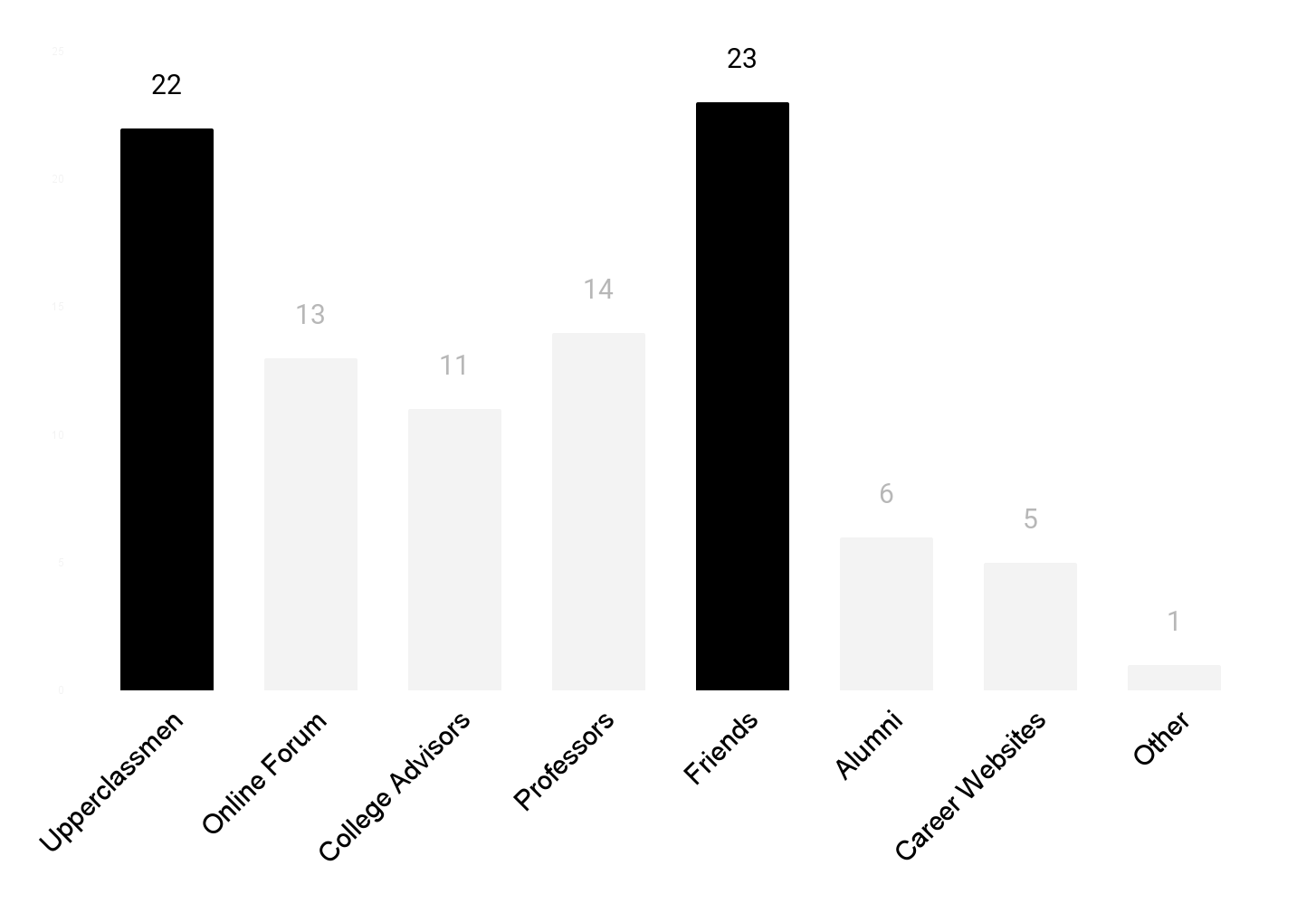
Where do you go for advice?
Competitive Analysis: Reference and Lessons
Without much time to create a product from the ground up, We decided to examine existing products to create our foundation off of. We looked at the strengths and weaknesses of LinkedIn, ADPList, MentorCruise, and UCSD’s Tritons Connect, all of which are popular platforms for mentorship opportunities.
Strengths
- A full list of qualifications and relevant info on profiles to help mentees choose the right mentor.
- “Matching” features that automatically suggest potential mentors and how compatible they are.
Weaknesses
- An overly broad network of potential mentors students must sift through.
- Only ADPList offered direct meeting scheduling to avoid the back-and-forth between mentors and mentees.
Insights

3 Main College Concerns
There are a few parts where it's helpful to get input from current med students, upperclassmen, etc. for a more realistic idea of how certain things go (e.g. course load, interviews, applications).

Reaching Out Is Daunting
I lack many upperclassmen connections so the advice I can get is limited, and I hesitate with the upperclassmen I know because I feel bad for "overasking".

Relatability and Relevancy
I struggle with a lack of people I can relate to (other women of color in a male-dominated field) and not knowing who to reach out to who is older but close enough in age to give relevant advice about how to pursue my preprofessional goals.
The Challenge
How might we efficiently connect college students with experienced student-mentors to bridge the knowledge gap, foster a collaborative and non-intimidating environment, and enhance the overall personal development experience within the university community?
Ideation
Product Structure: Minimizing The Steps To Meeting A Mentor
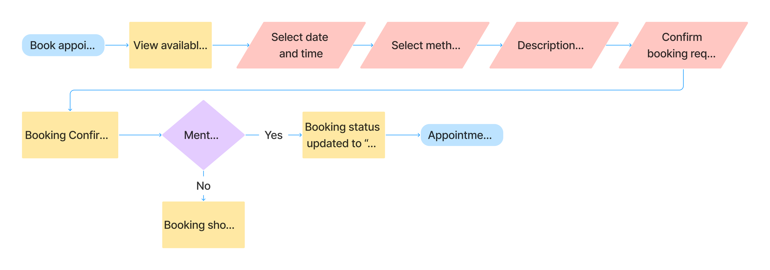
Only 12 hours remained in the challenge at this point. While we knew the time left for designing was tight, having a clear vision of the product structure was still important for ConnectU’s goal. Joanne and Milan began preparations for low-fidelity mockups while Nicole and I made flows focusing on minimizing the steps necessary to go from discovering a mentor to meeting them.
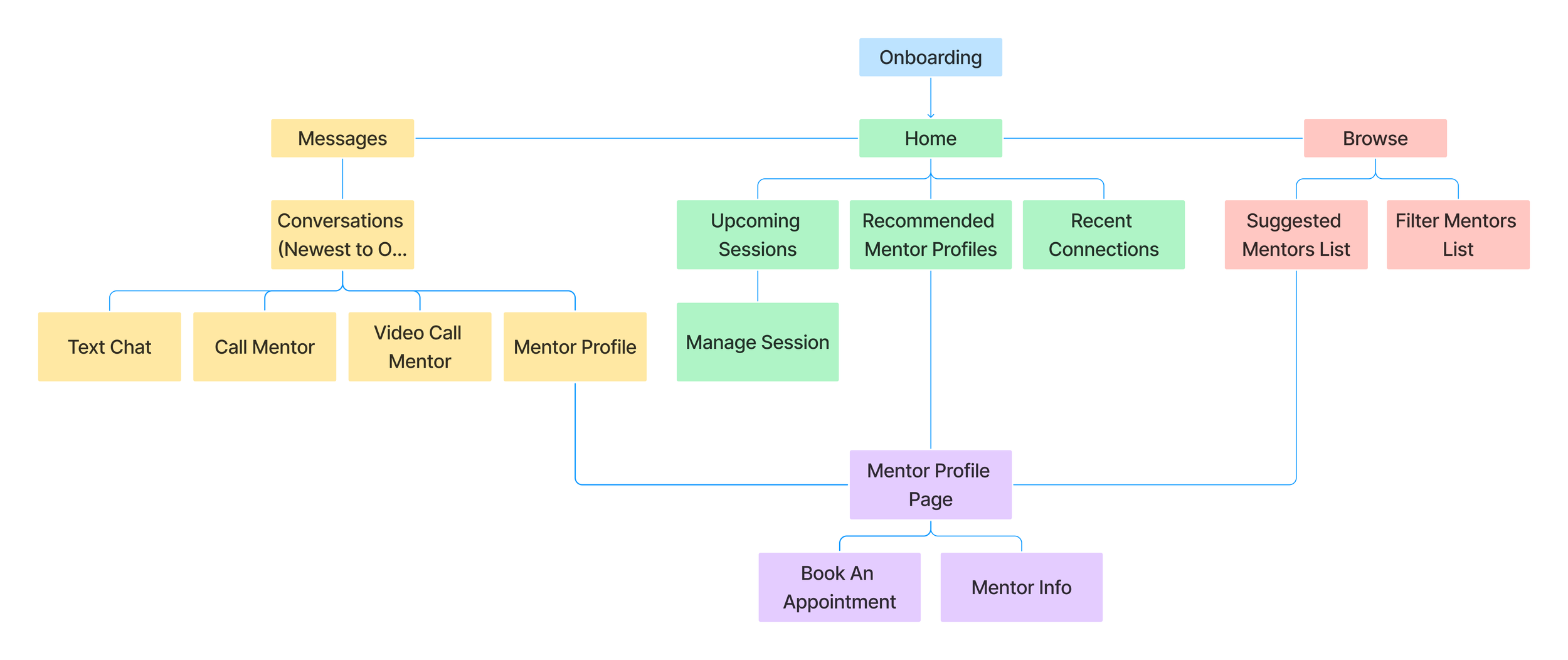
Sitemap
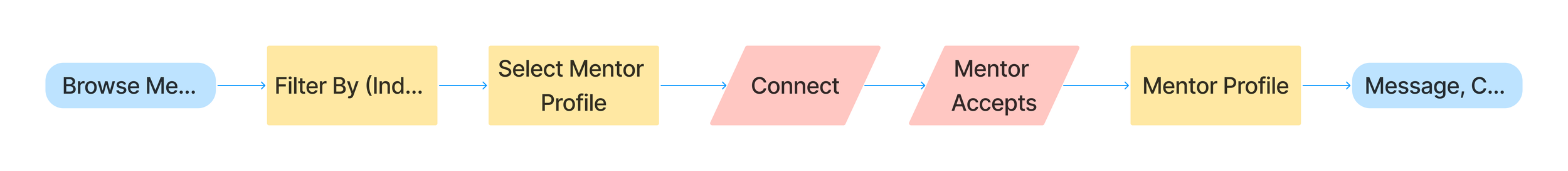
Reach Out To A Mentor Flow
Booking an Appointment Flow
Design
Mid-Fidelity Wireframes
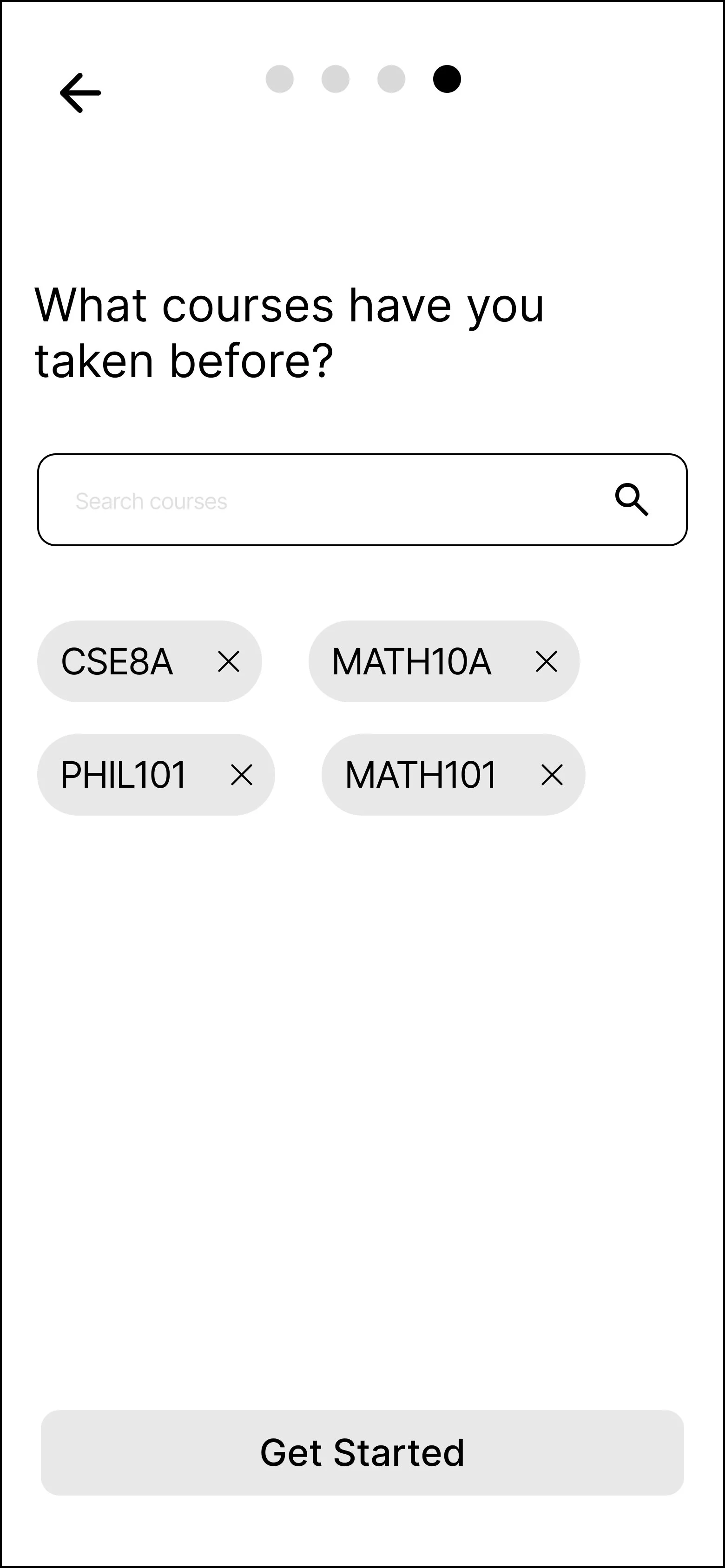
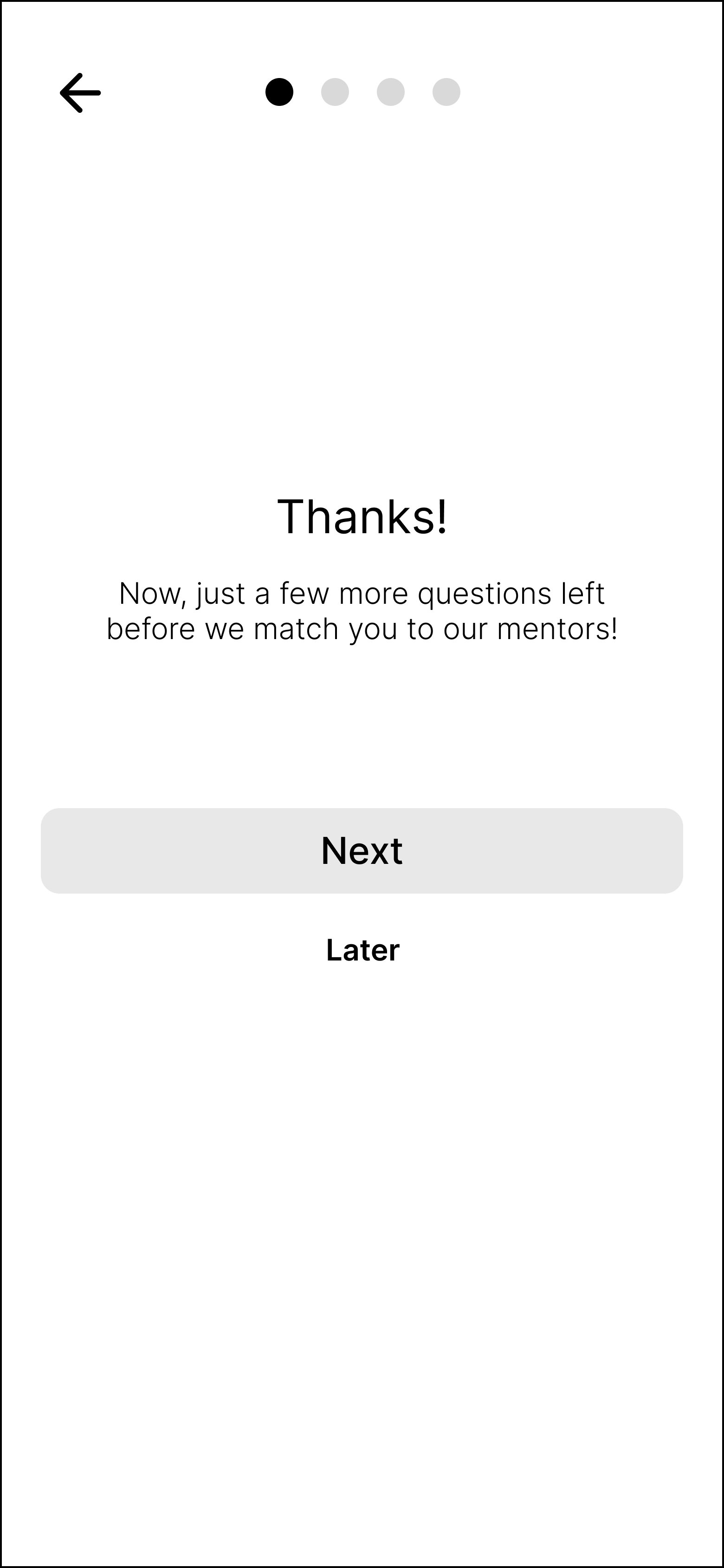
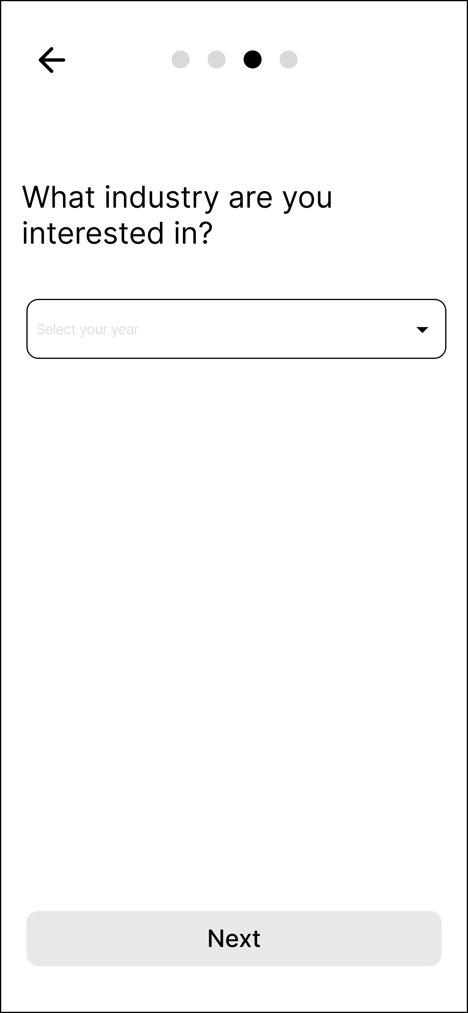
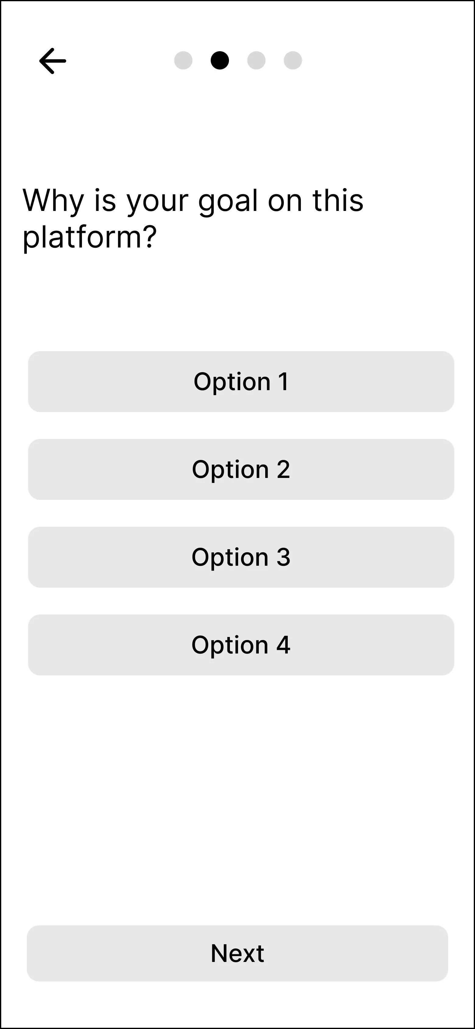
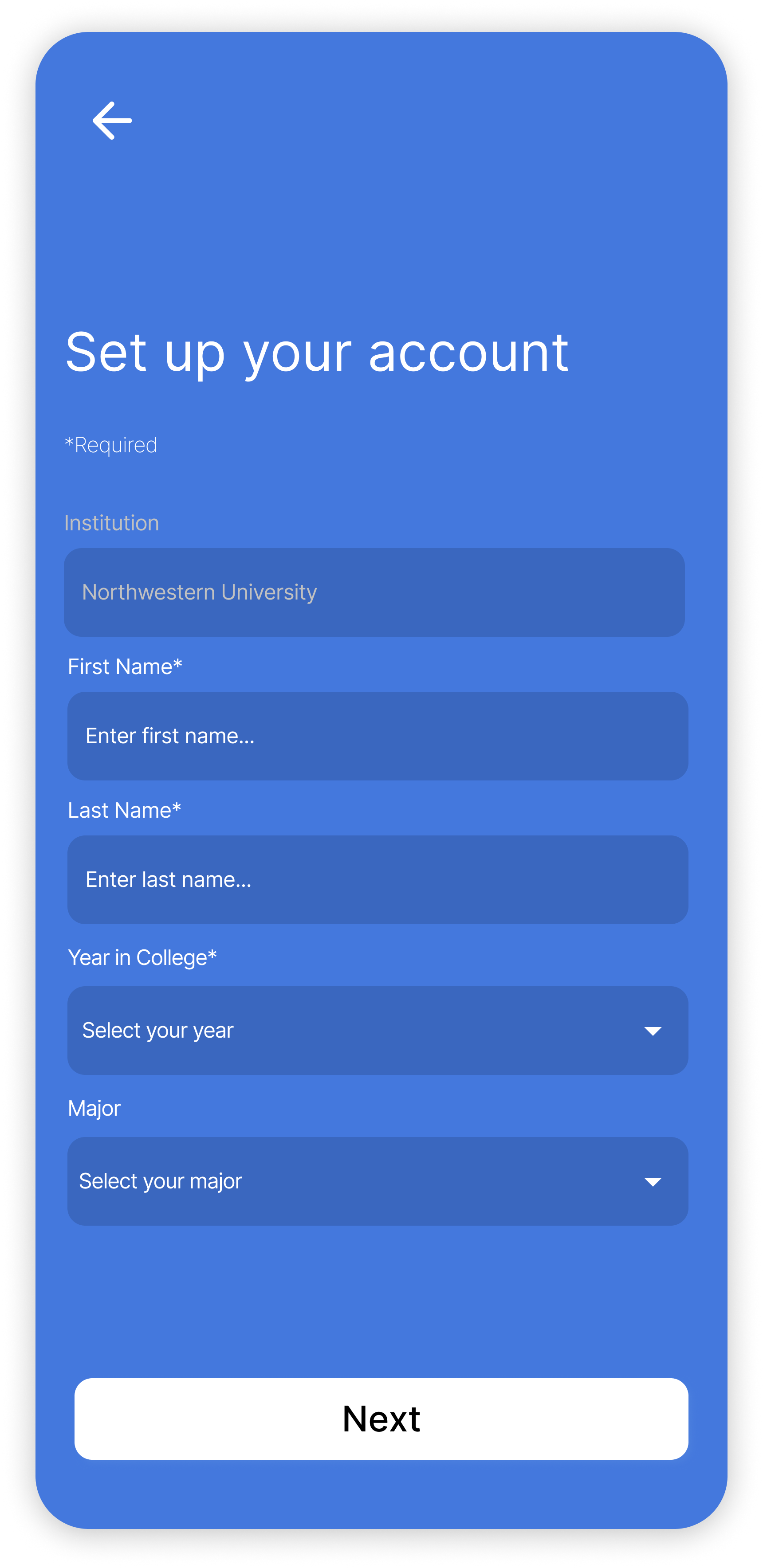
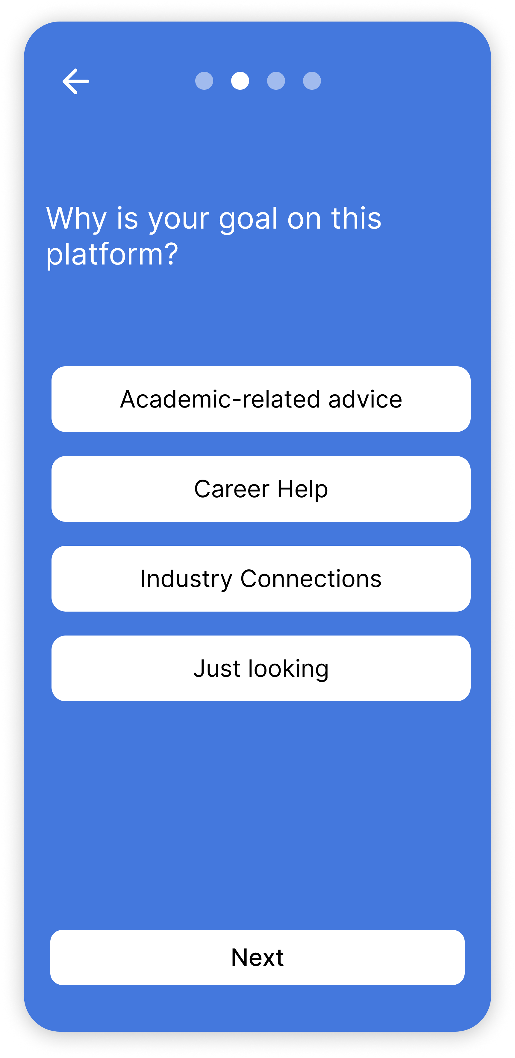
Laying out the three main pages of the app was straightforward, thanks to the IA diagram we had already made. The main challenge at this stage was creating the onboarding questionnaire. While we wanted to collect as much relevant data as we could to help students find the right mentor, the process needed to be succinct enough not to overwhelm them.
The Solution
Only three hours remained for us to create a polished design and a working prototype. As before, the key to saving time was staying on the same page and dividing tasks. Once we made a mood board and a rough design system, Nicole and I worked on booking and chatting, Milan completed the browsing and home pages, and Joanne took over the onboarding questionnaire. This was the result:
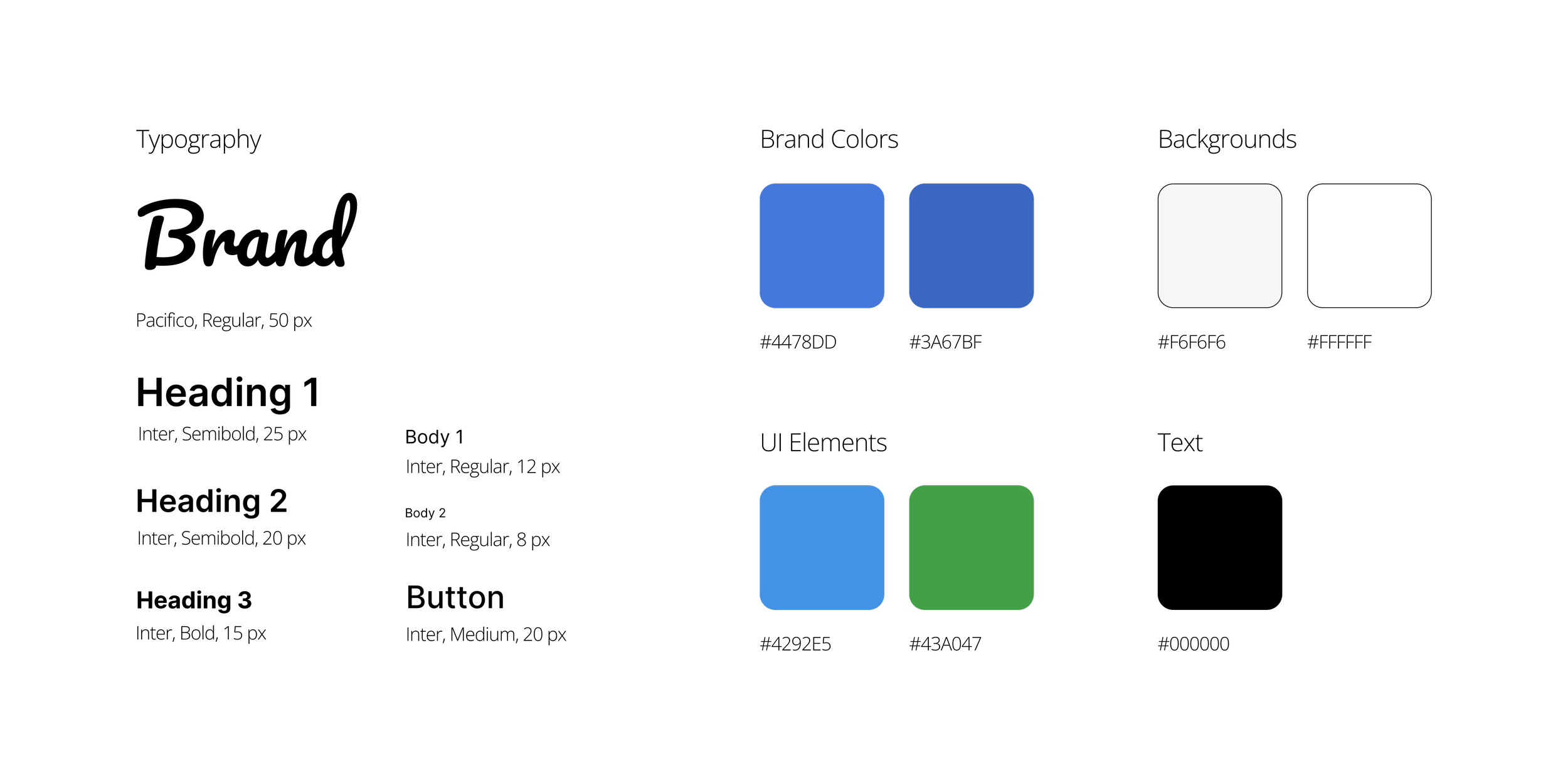
Design System
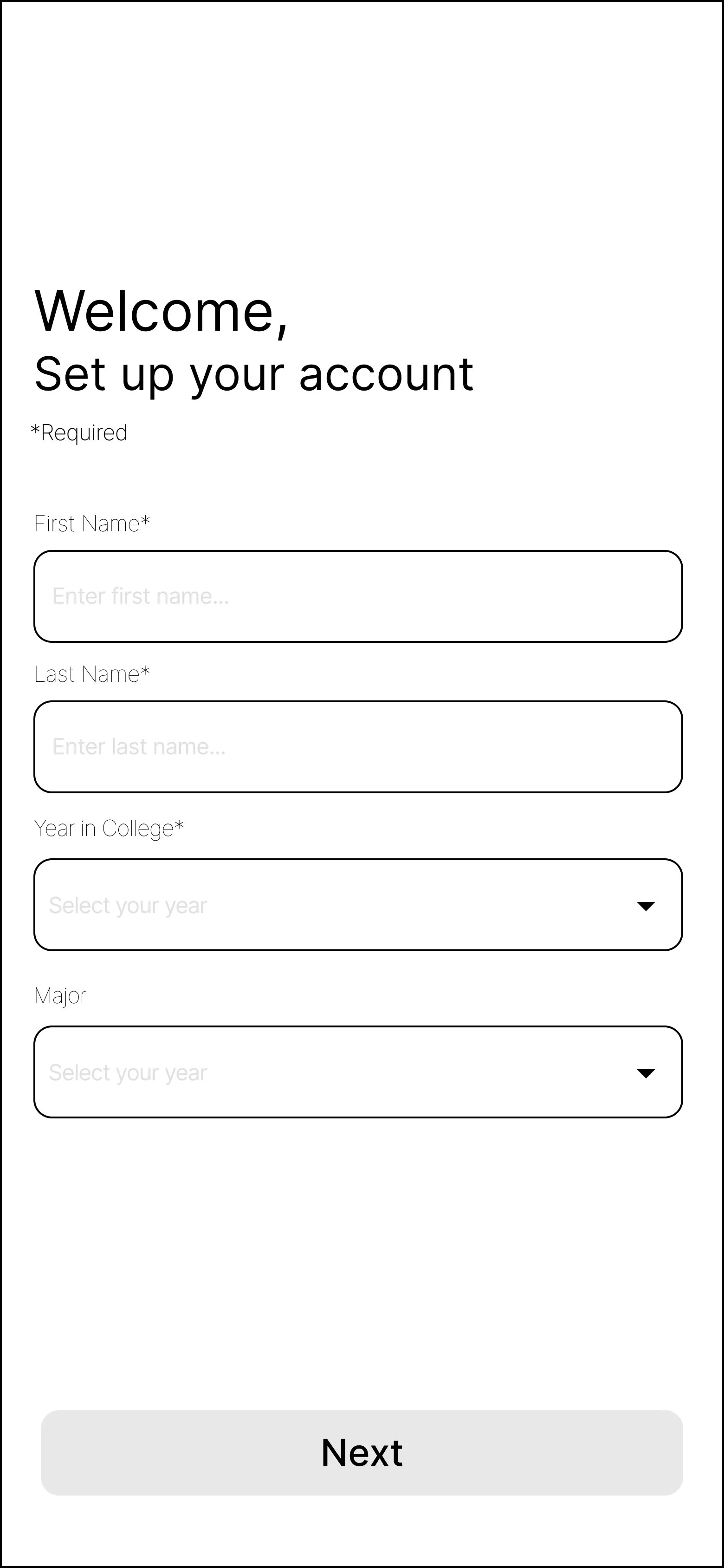
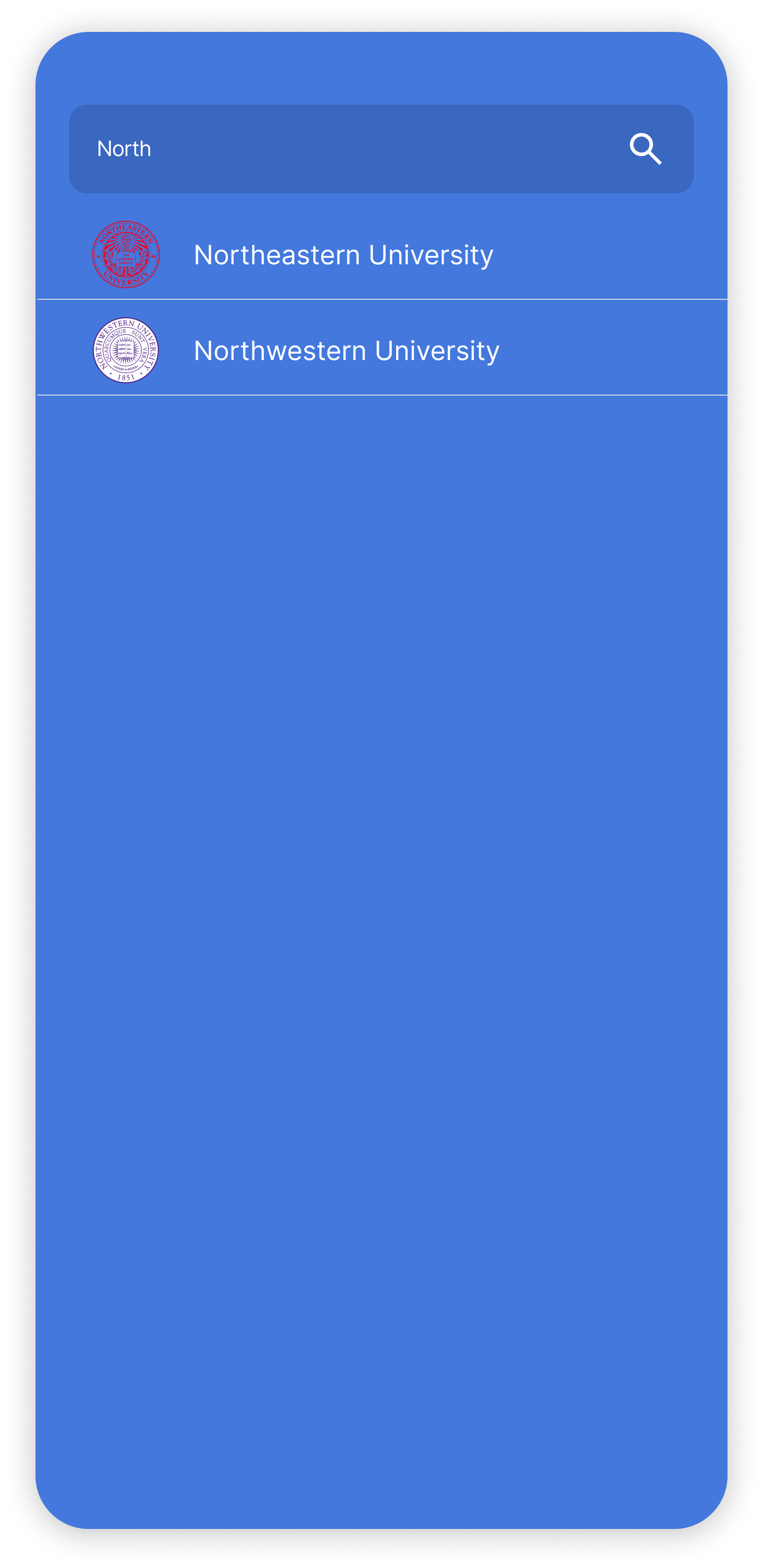
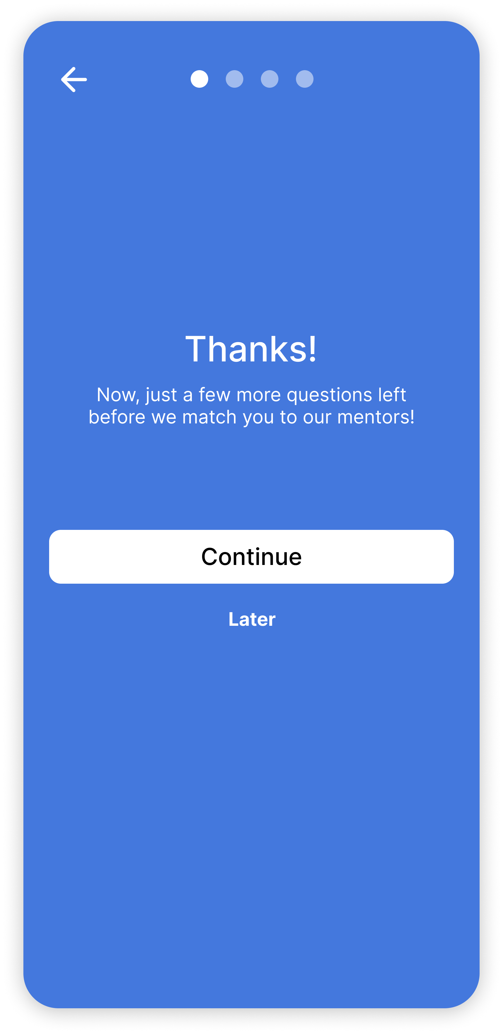
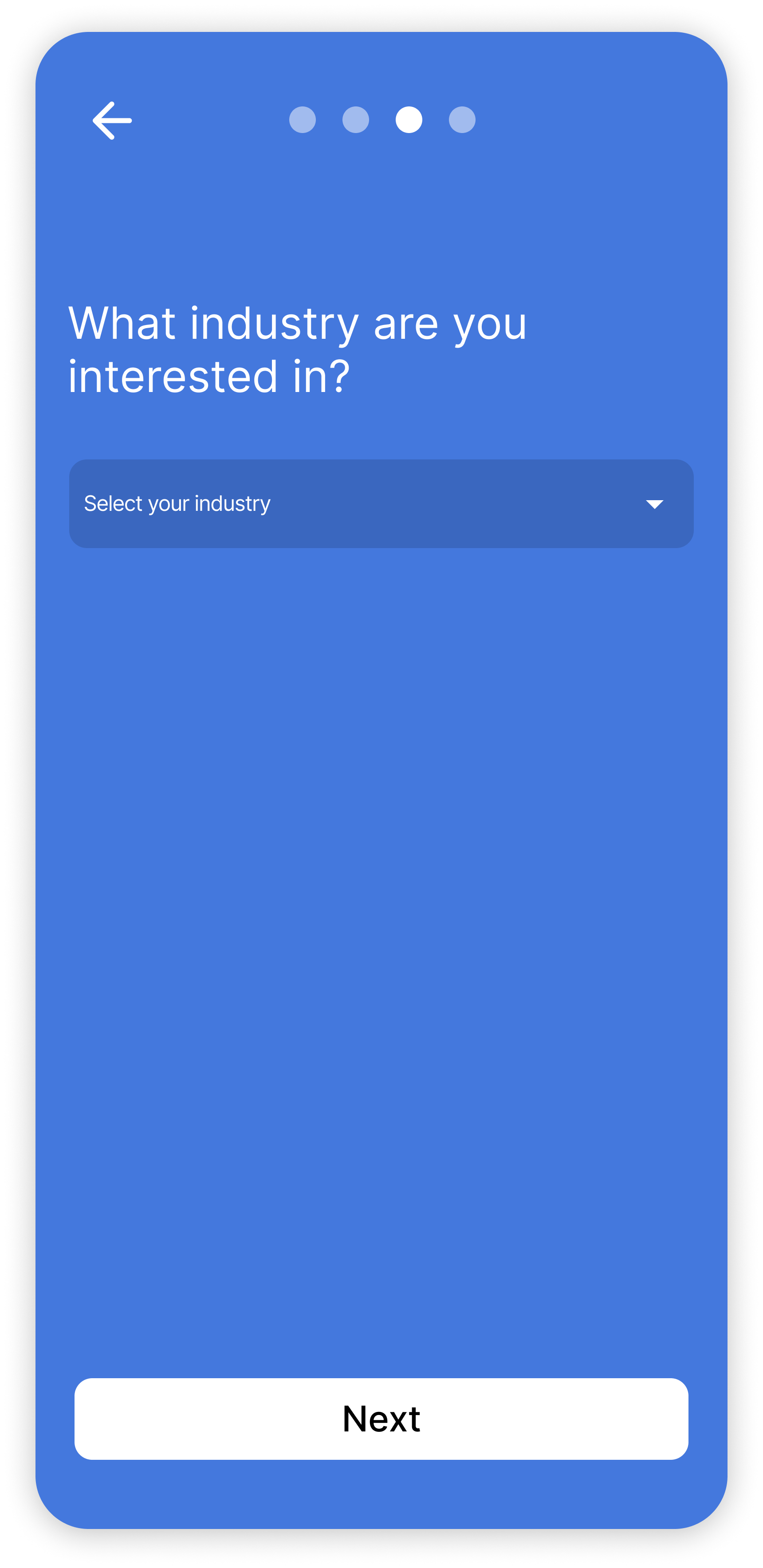
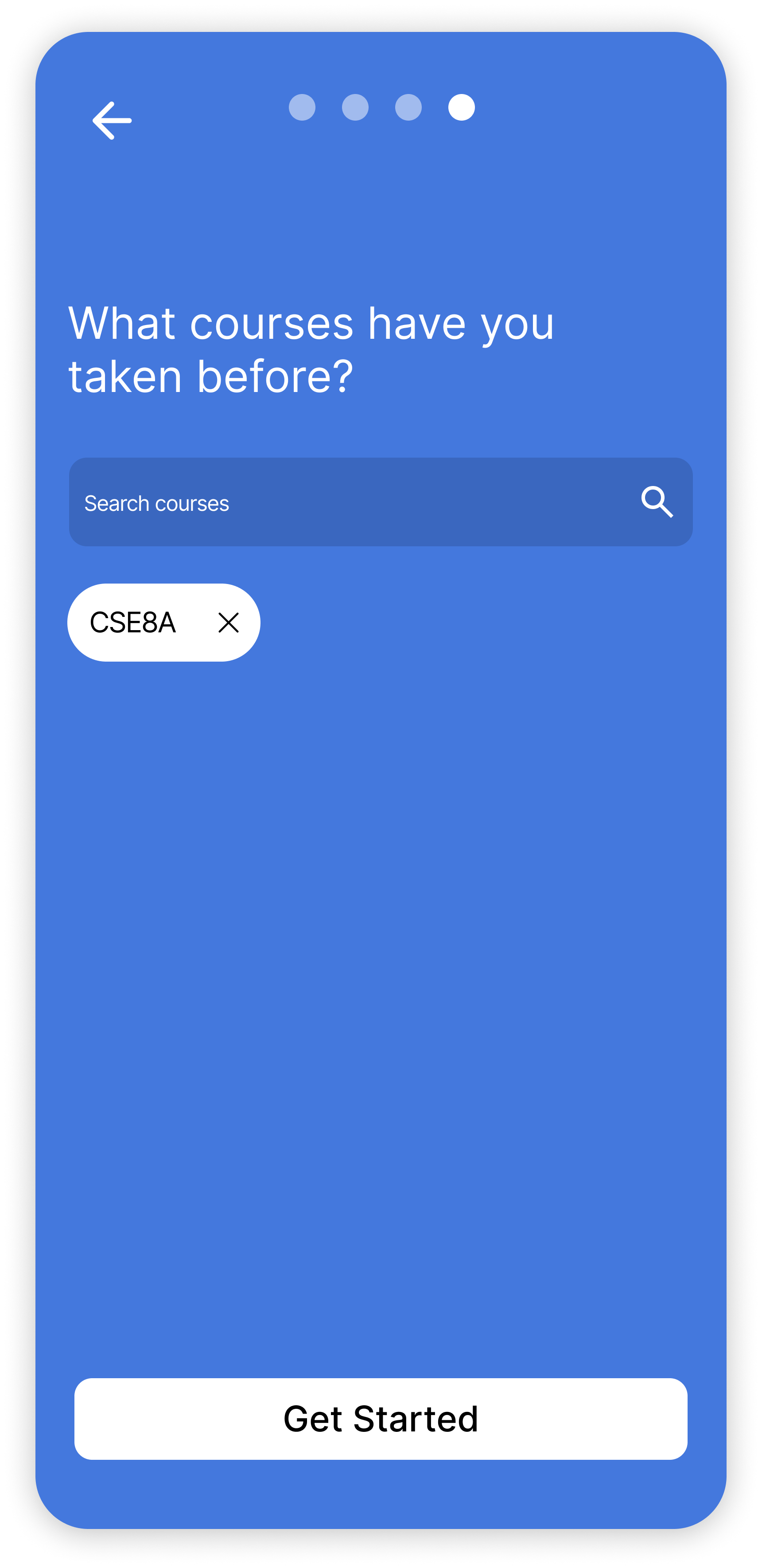
Onboarding + Sign Up
Main Pages
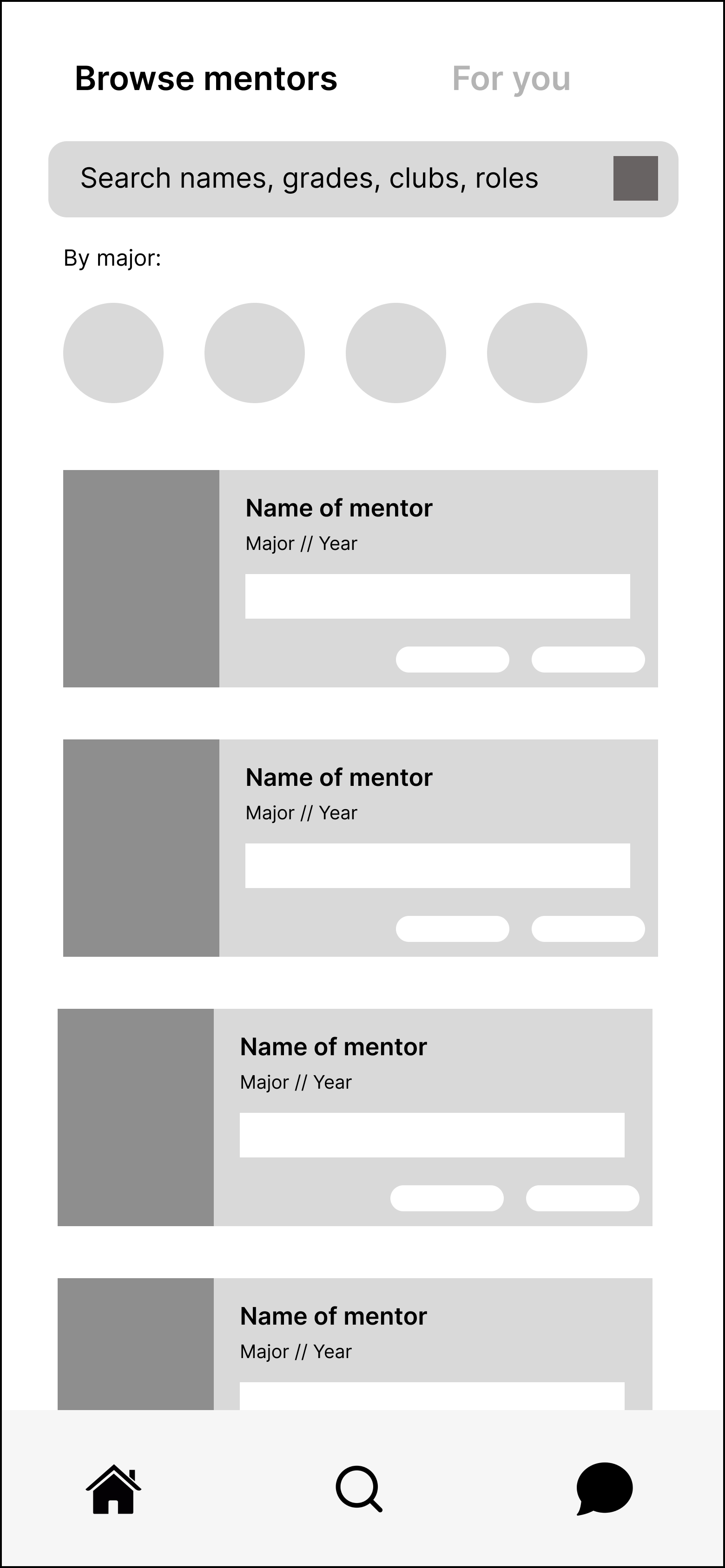
Easy Browsing
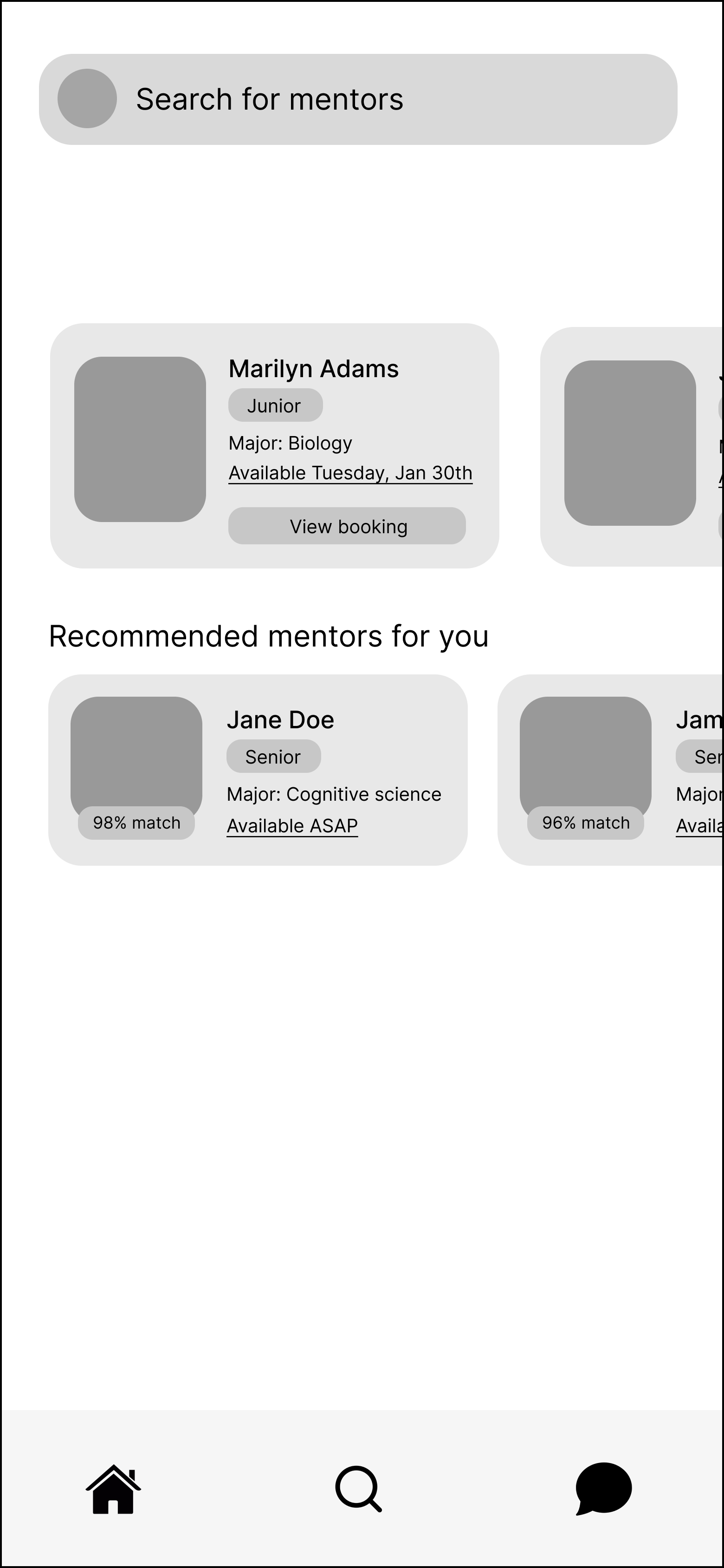
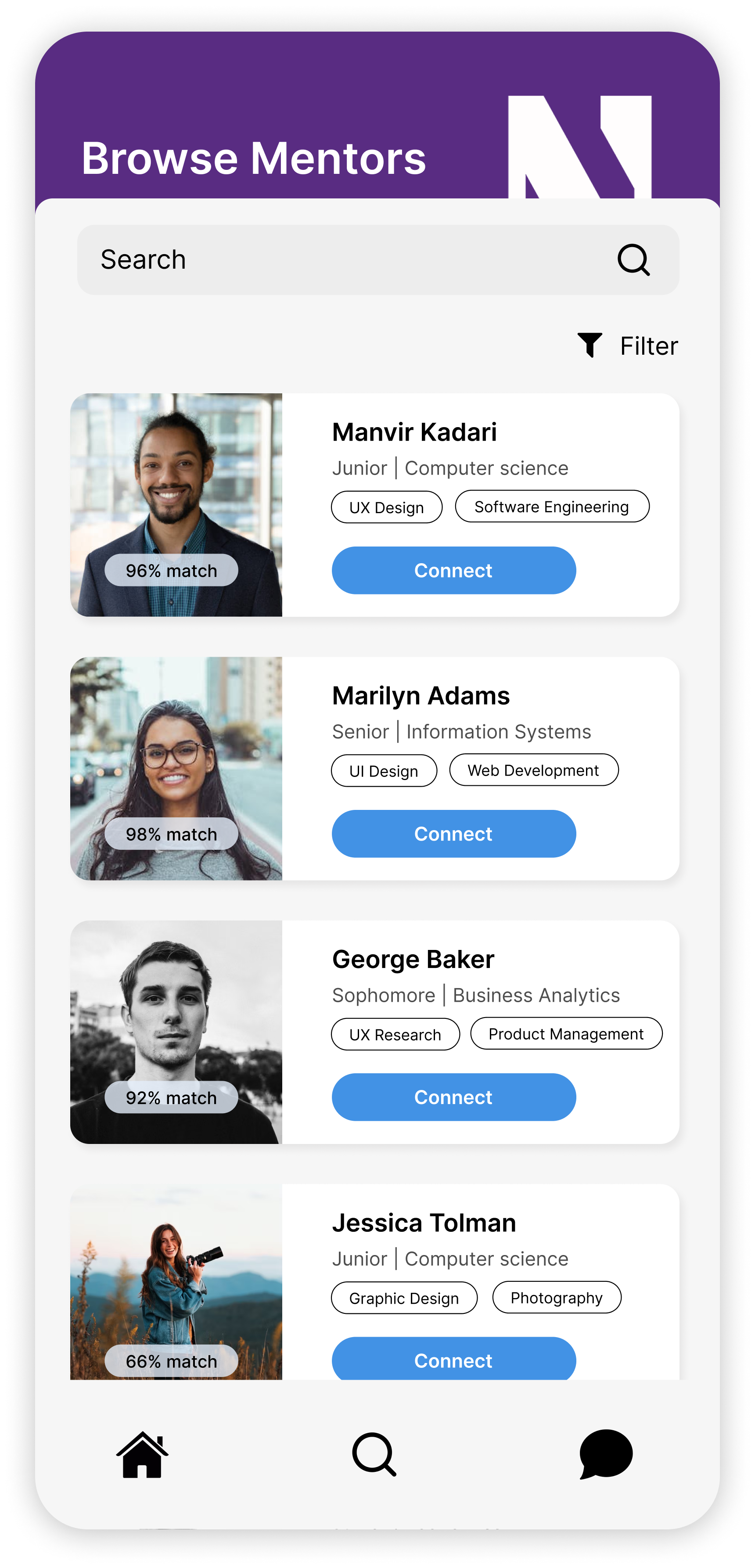
Each profile displays a match percentage based on how much factors like industry, major(s), and classes taken overlap. Users can also filter by these criteria to find what they need. Narrowing down options and finding the right mentor is made far easier this way.
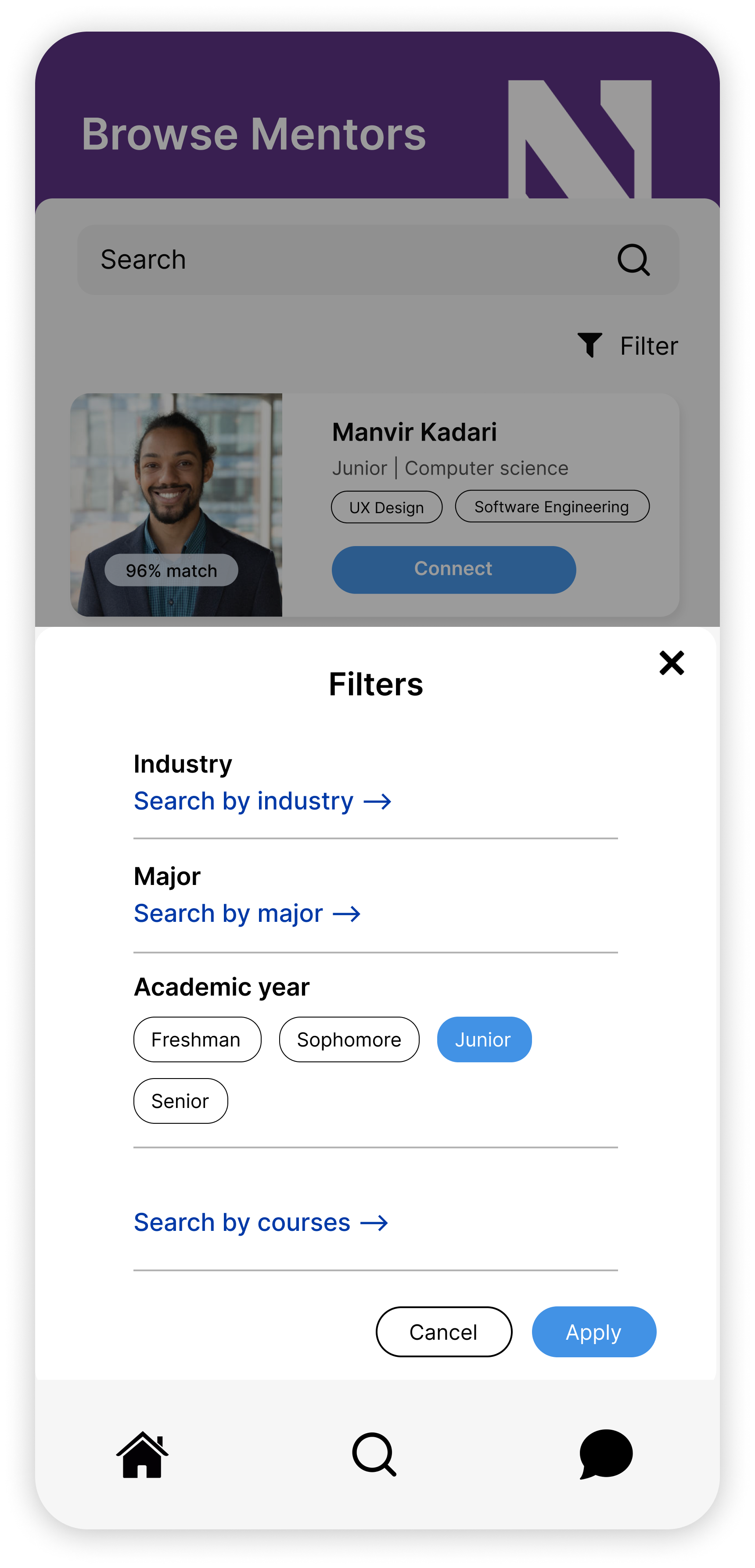
Browse (Filtering)
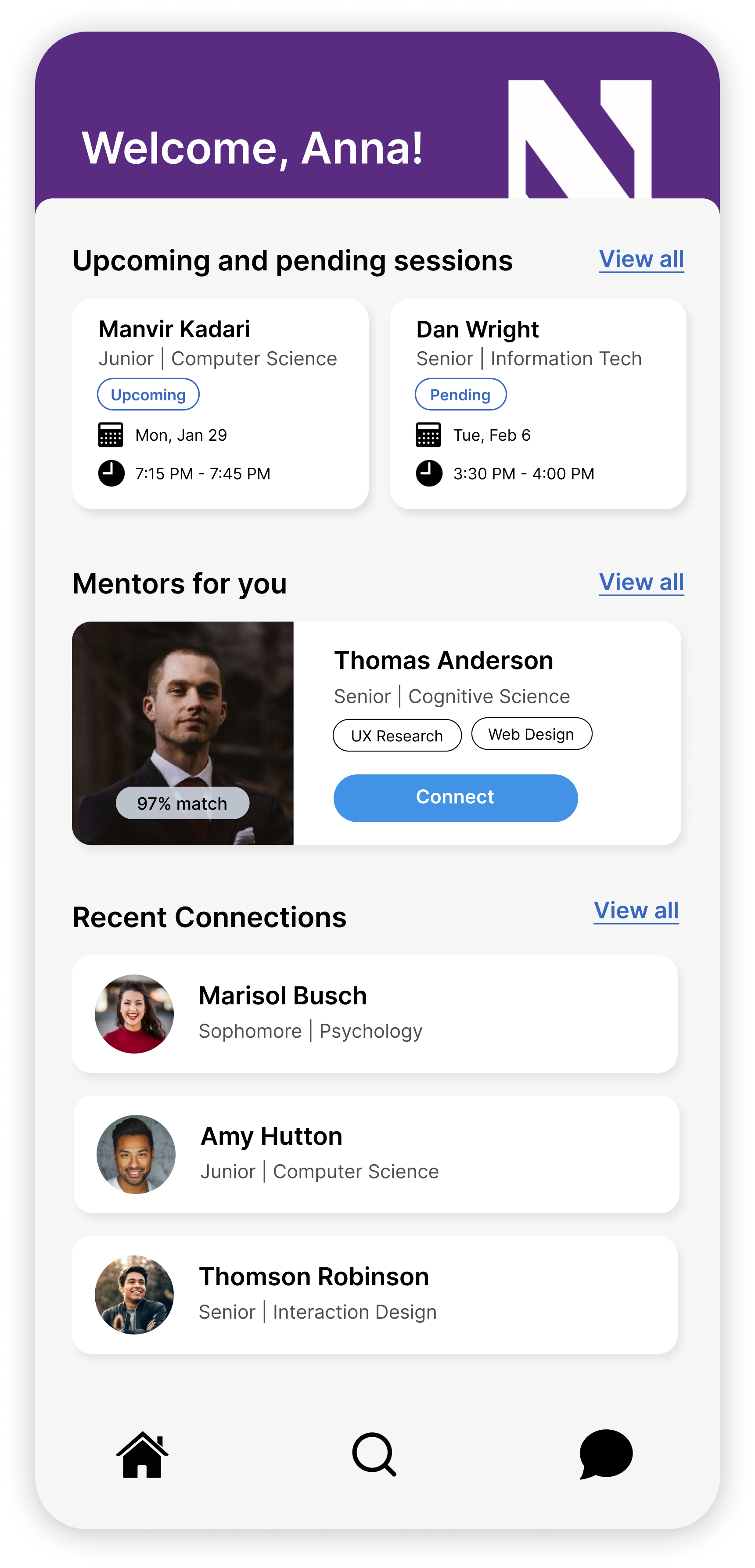
Home Page
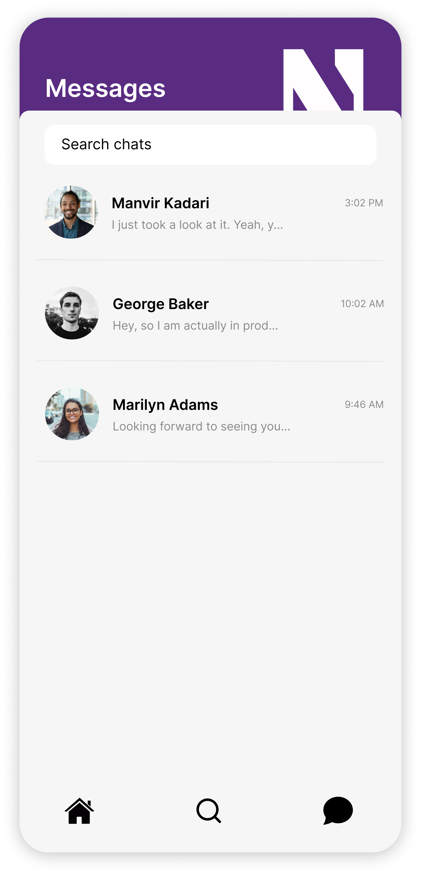
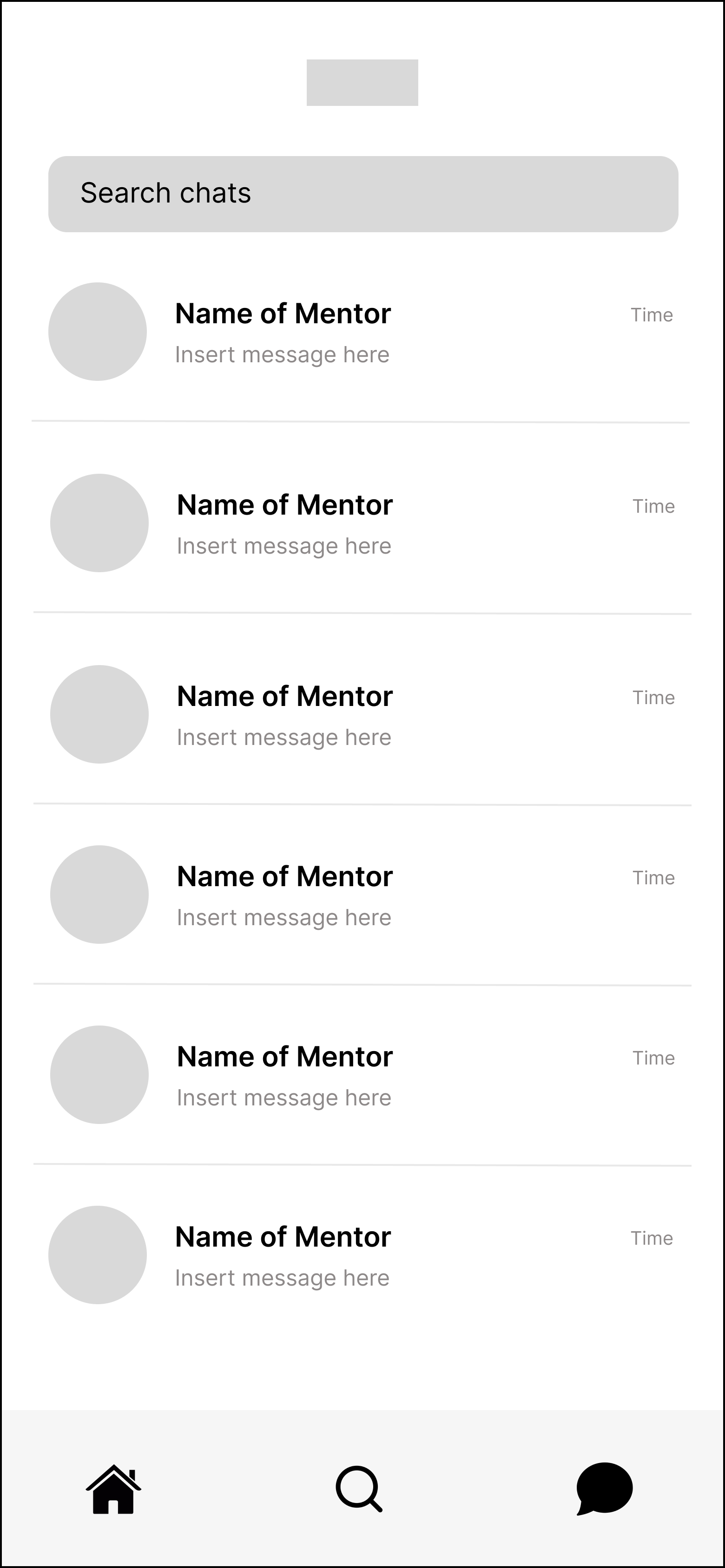
Chats Page
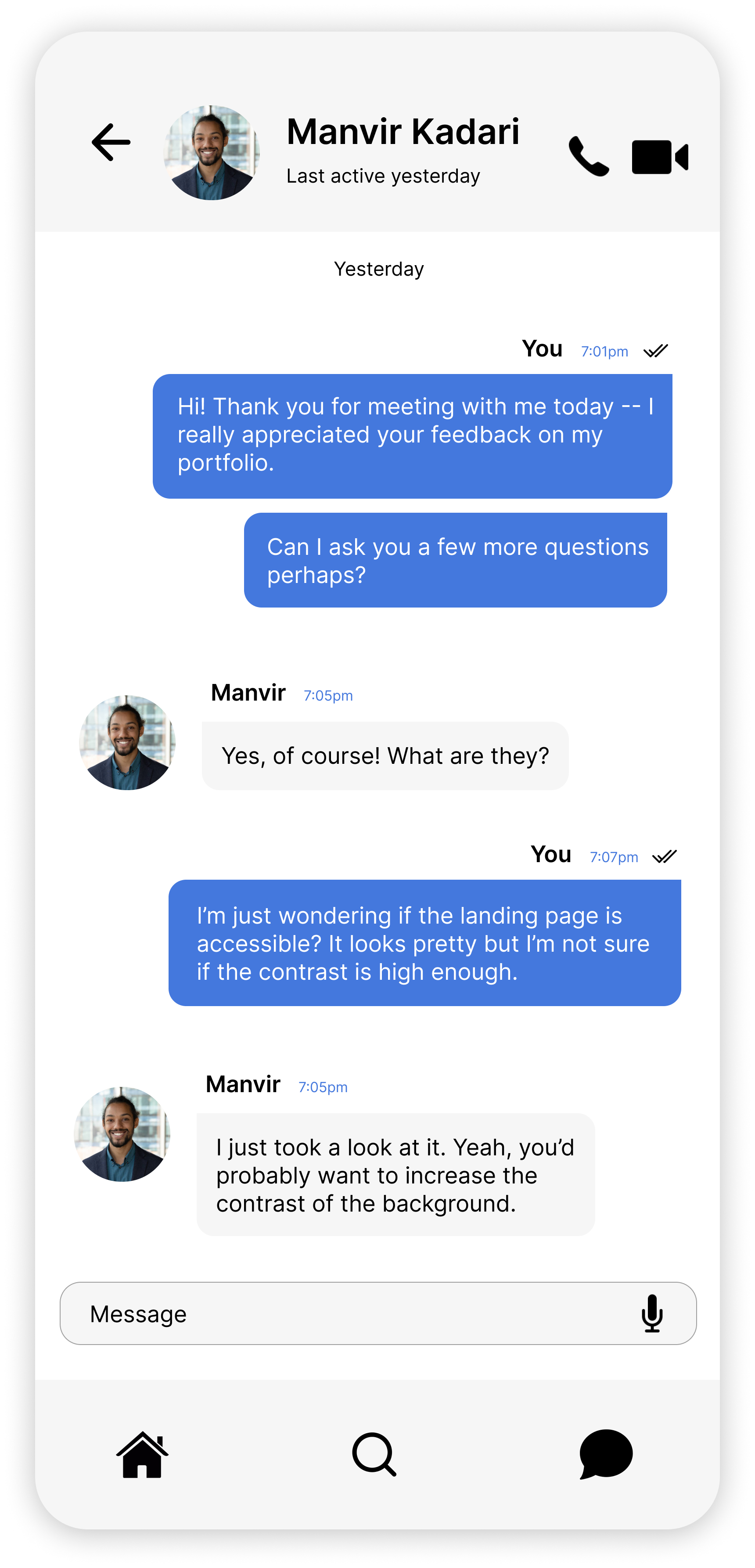
Text Conversation
Booking
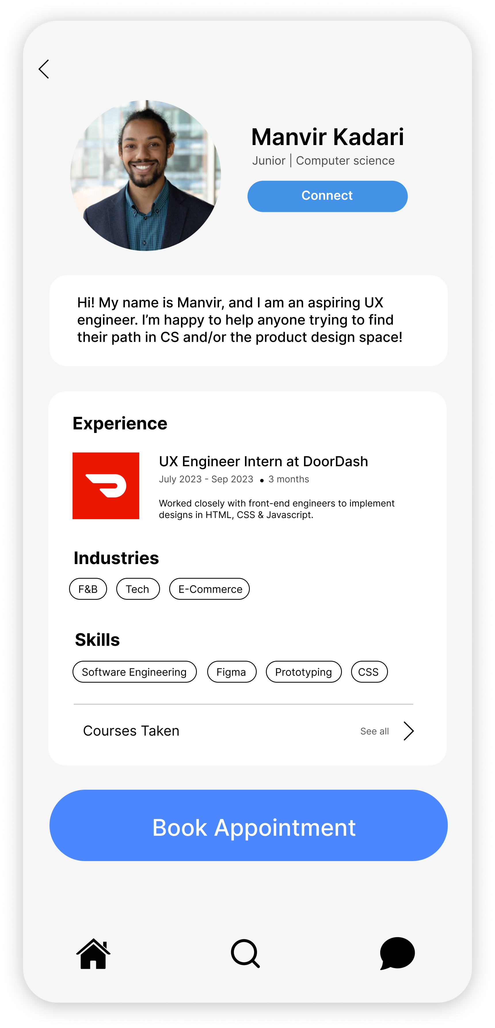
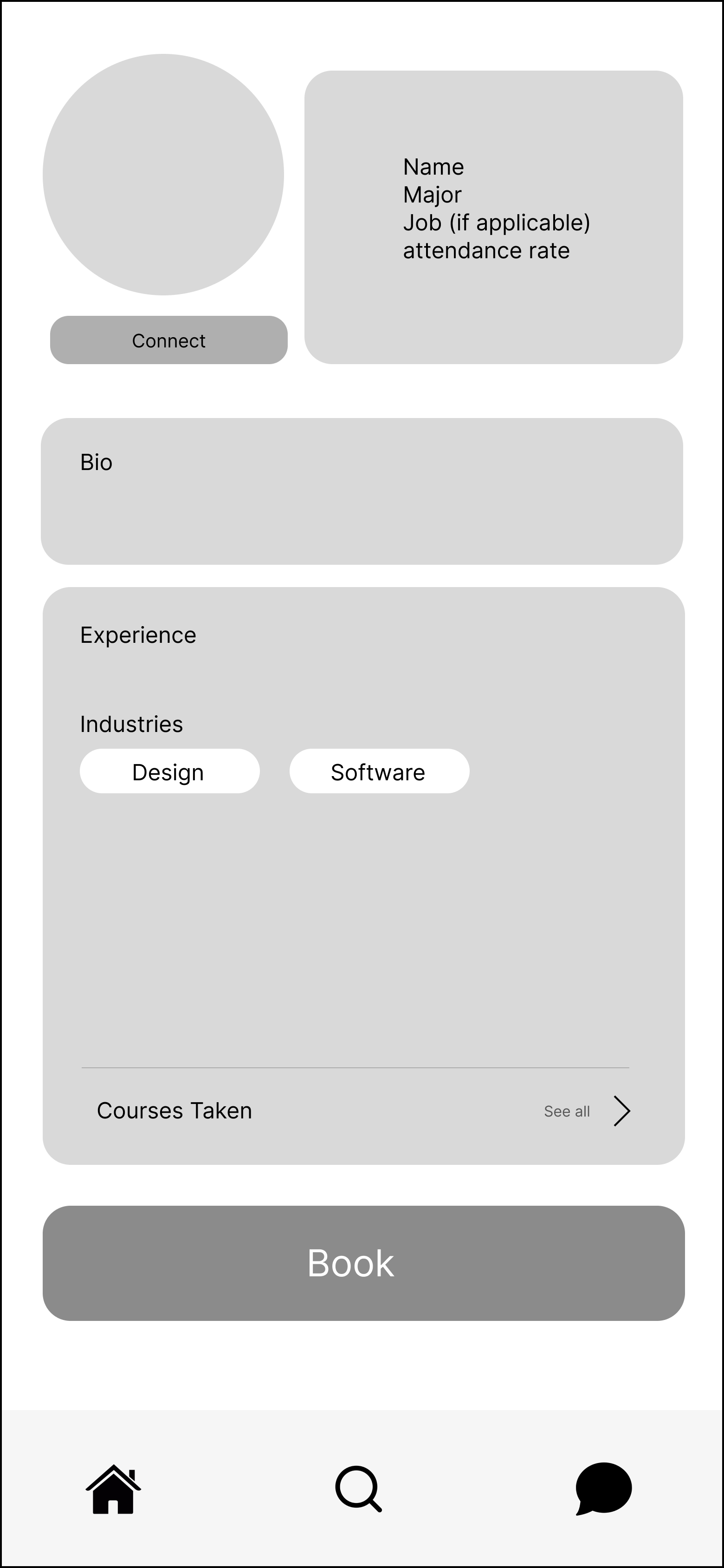
Comprehensive Info
We tried to cover any and all information that a student might seek advice about on the mentor profile. Additionally, the bio section provides an opportunity for mentors to give a brief introduction about how they can help their mentees, which could quell the intimidation students face when reaching out.
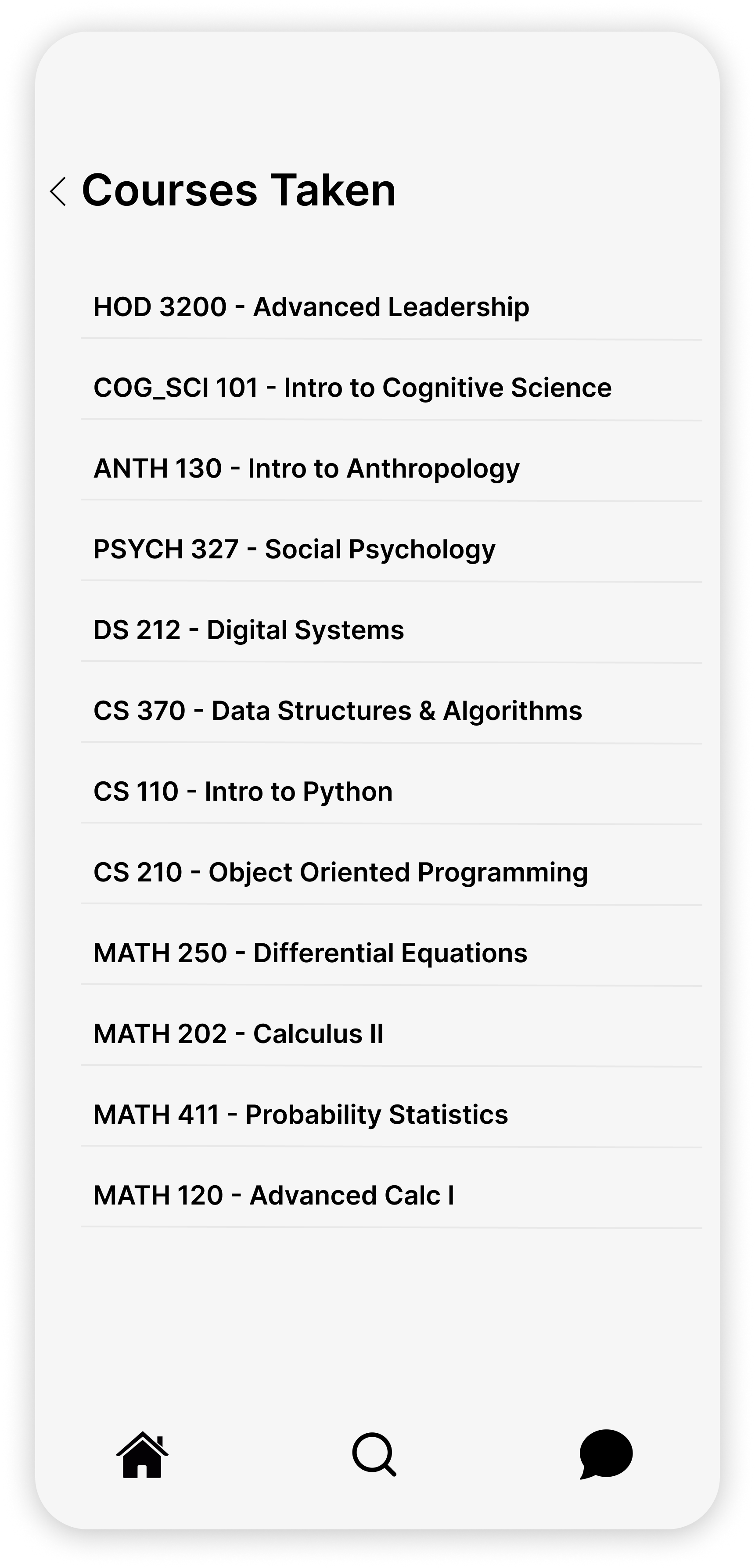
Courses Taken
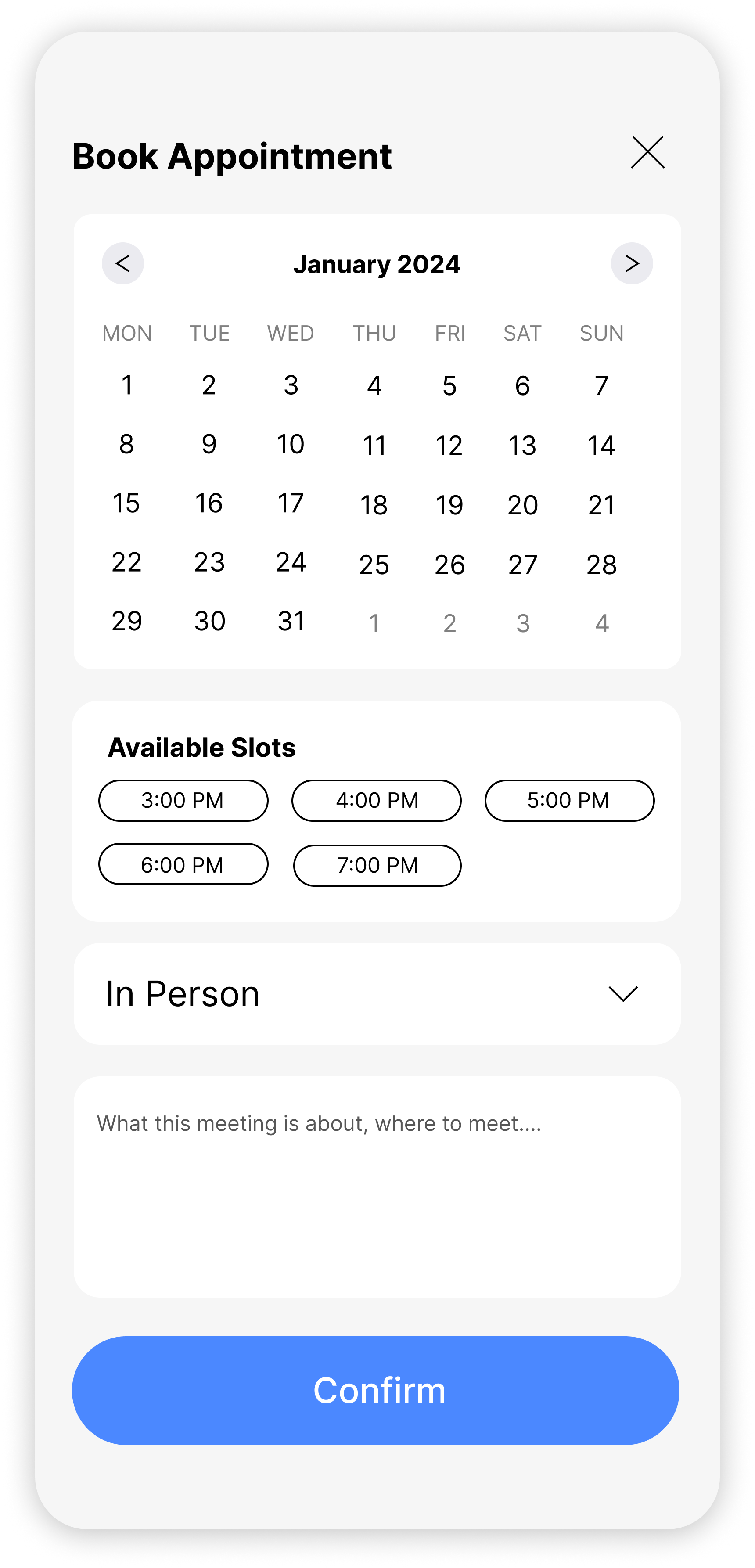
Meeting Details
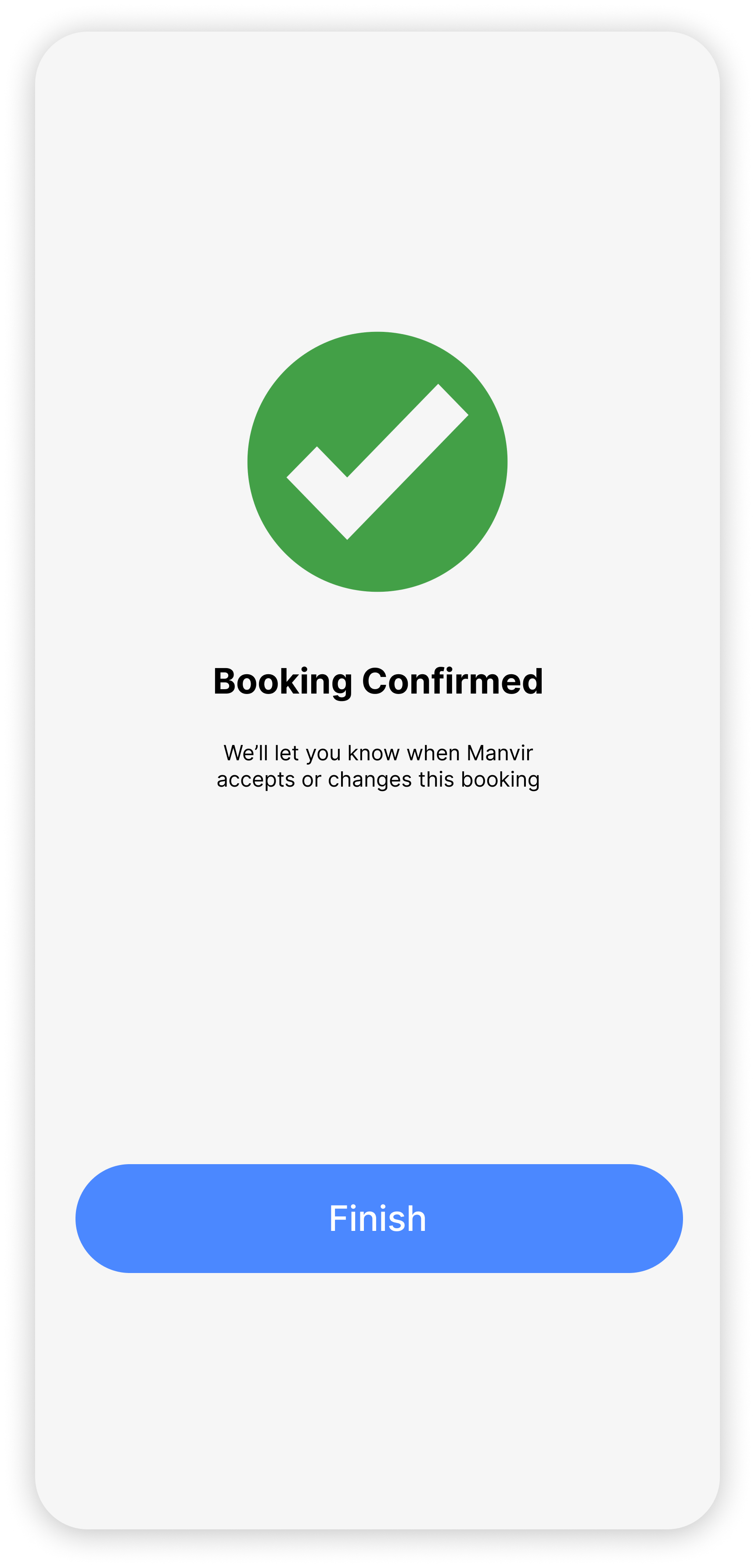
Booking Complete
Submitting
With just an hour to spare, we submitted our video demo, project link, and all required documents. Exhausted, I finally went to sleep while the judges reviewed submissions throughout the afternoon. Though ConnectU didn’t place, I saw it as a testament to the extraordinary efforts of every team rather than a shortcoming in our project. I was proud of our submission, knowing my teammates and I gave it our all.
Reflection
A Concentrated Team Effort
The Design-a-thon felt like a crash course on what a professional team environment might look like. We quickly overcame our awkward introductions, got comfortable stating our ideas, and compromised on disagreements within a matter of hours to be an effective team. This was my first time taking on a project with a group, and I got to see different approaches to designing screens in Figma. I noticed areas where I was still weak, especially in terms of design efficiency and prototyping, that I’ve since worked to improve through mentorship.
If We Had More Time…
There are several features and screens that would have completed the app, like a mentor status indicator, a booking management screen, and an account management page. There are also inconsistencies in the UI design that we could have polished with more time. I was able to see how different a team workflow is when there is an emphasis on creating an MVP and time constraints are involved. For future projects, I have a better understanding of how long phases of the design thinking process takes, as well as the importance of setting a proper timeline to follow.